The Domain Nobody Can Read Off Your Truck or Business Card
Your domain rides on your truck, your card, and your signs. If people can't read it at a glance, you're paying for advertising that leads nowhere. Here's the fix.
Your domain name does more work than you think. It rides on the side of your truck at 45 miles per hour. It sits on a business card in someone's wallet for three weeks. It's on your yard sign, your invoice, your ad on the back of the grocery receipt. Every one of those is a chance for a customer to find you.
But only if they can read it.
A hard to read domain name on signs and business cards is a quiet leak. Nobody complains about it. Nobody tells you they gave up. They just don't show up, and you never know why. Let's talk about what's actually happening, and what to do about it.
What "hard to read" really means
People think a domain is fine because they can read it on their own screen, sitting still, looking right at it. That's not the test. The test is a stranger, glancing for two seconds, from a moving car or a crowded counter.
Here's what trips people up in the real world:
- Runt-together words. When two or three words jam into one string, the eye has to stop and cut them apart. Bigskyplumbingco takes a beat. BigSkyPlumbing reads clean.
- Odd spellings. A cute misspelling that looks clever on a logo becomes a guessing game on a truck. If a customer has to wonder whether it's an i or a y, you've already lost them.
- Extra bits. Hyphens, numbers, and tacked-on words like "the" or "my" add characters people forget the second they look away.
- Small type. A long domain forces smaller letters to fit the space. Now it's not just hard to read—it's physically too small to read from the sidewalk.
The problem gets worse the faster people move. A card in hand is one thing. A wrap on your van in a parking lot is another. A billboard is the hardest of all.
The math on a truck nobody can read
Say you spent $3,000 wrapping a work truck. That truck drives past thousands of people a week. The whole point is that someone glances, remembers your name, and looks you up later.
If your domain takes three seconds to decode, most people won't bother. They're driving. They've got their own day. The wrap still looks sharp—but the part that turns a glance into a customer just failed.
You paid for the truck. You paid for the card. You paid for the sign. A name people can't read at a glance means you're paying for the ad and throwing away the response.
Say it, then look at it
There are two moments where a domain has to work: when someone hears it and when someone sees it. Most small businesses only ever check the first one. Both matter.
The see-it test is simple. Print your domain at the size it'll actually appear on the sign or card. Tape it to a wall. Walk back ten feet. Can you read it in one look, no squinting, no re-reading? Hand it to someone who's never seen it and ask them to read it out loud. If they pause, that pause is the problem.
The hear-it test matters just as much, because you say your domain on the phone, in ads, and at the counter all day. We wrote a whole piece on that: The Radio Test: Can a Customer Spell Your Domain After Hearing It Once? A name that fails one test usually fails both.
The usual suspects
A few choices cause most of the trouble. If your current domain has any of these, it's worth a hard look.
Hyphens and numbers
These are the biggest offenders on print. A hyphen looks like a dash, a smudge, or nothing at all when the type is small. A number raises a question every time: is it "4" or "four"? People forget both. We break this down in Hyphens and Numbers: Why They Send Customers to the Wrong Website.
The wrong ending
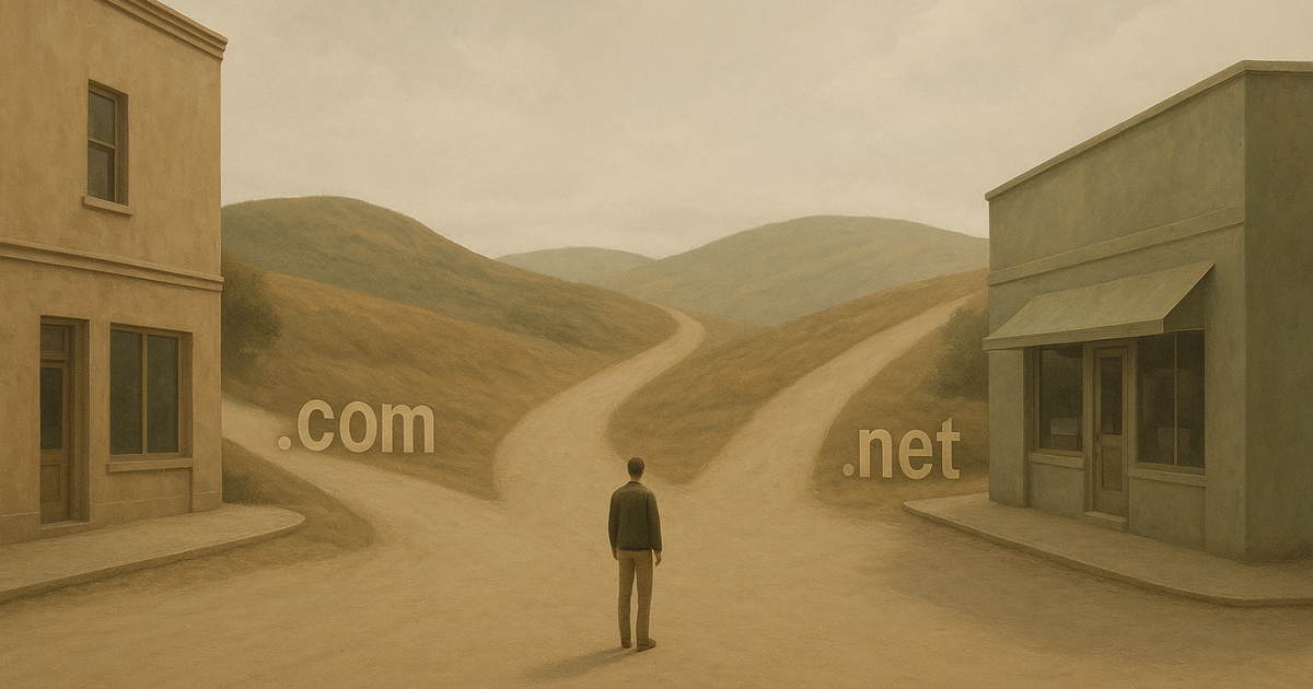
If your name ends in .net or something less common, people default to typing .com. On a card, they might not even notice the ending, then land somewhere else. See .com or .net? How the Wrong Ending Quietly Loses You Customers.
A near-miss that lands on someone else
When your domain is easy to mistype or misread, some of those readers end up on a competitor's site by accident. That's covered in When a Typo in Your Domain Lands Customers on a Competitor's Site.
What a readable name looks like
The best ones are short, plain, and built from words people already know. Your trade and your city work well because customers are already thinking in those terms—"Denver roofing," "Tampa dental." A name like that is easy to read, easy to say, and it tells people what you do before they even visit.
Good print names tend to share a few things:
- Two or three real words, no made-up spellings.
- Short enough to print big.
- A .com ending when you can get it.
- No hyphens, no numbers, nothing that needs explaining.
Is it worth changing?
If you already have a site on a hard-to-read domain, moving is less trouble than most people expect. You keep your old address pointed at the new one so nobody gets lost, and you tell Google about the switch. Google's own guide on moving a site with URL changes walks through the steps.
The reason to do it is the same reason you wrapped the truck: you want people to find you. A name they can read the first time, from across the parking lot, does that job. A name they can't read makes every sign and card work harder for less.
Want to see what a clean, readable name for your business would look like? Take a minute and browse names for your city or trade—or send us one specific name you're weighing and we'll give you a straight answer on whether it reads well. No pressure, no rush.